Pages

Monday, February 28, 2011

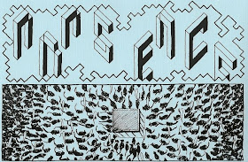
Loserdom #20


loserdomzine@gmail.com
www.loserdomzine.com

As with most punk zines this issue of Loserdom is filled with reviews of 7 inch records and other zines, interviews with bands, and scene reports.

However! It is important to note that even if you have no interest in those things at all, this zine is still worth checking out for a number of articles and interviews on some pretty neat and interesting things.

The first of these is an illustrated piece about a food co-op and a discussion that they had concerning vegetables from Israel. To boycott or not to boycott was the question that concerned them, and while both sides of the argument are represented here the author makes no secret of what side of the argument they fall on. The author talks to a number of other food co-op members and asks them about the idea of a boycott and why they thought it, at least initially, failed. It's interesting to look at things like this and I wonder if people are becoming less political than they have been in the past. You read about things like boycotts of South Africa in the 1980s and political songs getting airplay and I find it puzzling; have people just became apathetic or has our society changed in some other way? Hmmm...I feel like I need to discuss this with someone in person.

The second piece is an interview with one of the people that works at La Fanzinotheque, which seems to be a pretty rad library/art gallery/social centre type place in Poitiers, France. It's pretty inspiring that a place like this has been around for over twenty years! My only problem with this (and a couple of the other interviews in here) was that it seemed to reprint everything that the other person said/wrote, and I think parts of it could have been edited a bit.

There are also pieces on digital storytelling, winter cycling/swimming (horrifying!), a comic about how punks really can't seem to stop drinking, and an interview with a guy from Poland who runs a distro/label in Ireland that is pretty interesting, even if you're not into the scene, as it discusses some of the economics behind that sort of thing (ie. don't start a punk label if you want to get rich).

Sunday, February 27, 2011

What it is & What it Was


By Douglas Noble
www.strip-for-me.com

This is a story about a woman (a widow) and a young girl. It spans many years, and has an air of melancholy and sadness about it, as do many stories concerning death, longing, and loss.

The last time I reviewed one of Noble's comics I ended up viewing it as more of a series of visual poems or narrative experiments. This one is more of a straight forward comic, but it stil uses some techniques that I found interesting.

Narrative captions are not as popular in comics as they once were, but they are still used, and here Noble uses them in a particularly literary manner, combining elements of prose with those of comics. Showing when he can, telling when he can't.

Sure, you could have one of the characters saying (or thinking) some of these narrative captions as dialogue, but it would give a considerably different feel to the whole comic. The characters would be aware of everything that they were doing, and their actions would gain a strangeness from this self-awareness, while in real life people act without talking or thinking about something specifically. Here the way information is presented allows us to gain insight into the characters in a way that avoids clumsy exposition.

Of course the page I've scanned in (below) is one of the few without large amounts of text. But even with the small piece included there ("For a second the clocks don't tick.") you can see how Noble has used the omniscient narrator to portray information that would be difficult, if not impossible, to convey to the audience otherwise. Shots of a clock not ticking? The reader doesn't know if time has frozen or what has happened. A personal narrative caption (from either the girl or the old woman) thinking back and remembering that moment wouldn't work so well either and would give the whole story a different feel.

The third person narration makes it seem like a story being told specifically to the reader, which isn't a technique I remember seeing in comics that much. (Of course now I will either stumble across like eight, or you'll all tell me about some.)

Artwise Noble uses a very thick line for much of his art, leading to characters having few facial details and their eyes represented as inky black pools. Noble also uses a lot of close up panels of specific details (a mouth, a hand, an apple) and panels which do the exact opposite by pulling back to such a distance that we're left only with featureless sillouhettes and shadows. These methods may have been used because Noble is trying to get around certain weaknesses in his art, but it succeeds in giving the whole comic a sort of European art-movie feel to it, though part of that might have been the scene featuring two people standing on a bridge in Venice talking about loss.

I really enjoy how Noble seems to be trying to do new things with his comics (even if, as I said in my last review, he doesn't always succeed). It's nice to see an art form growing and evolving as people try new things. The fluidity shows that new techniques are still out there and new masterpieces are still to be made.

Saturday, February 26, 2011

Clipper Guts Issue Five


By Joe9t
myspace.com/clippergutszine

This zine was sent to me by Zinemonger Distro, a distro that distributes free zines. Awesome! Go check out the site to find out how you can get some!

The idea that there is only one type of person who can makes zines is a strange one. I'm aware that they definitely seem to attract a certain type, but in reality that type is just people who like to produce things on print.

So when I came across this quote:

"I don't own any Black Flag records. I didn't know who Ghost Mice were until a couple of months ago. I'm not a vegan. I have an office job. I watch crappy daytime television if I can. I have no idea where my nearest radical boookshop is. I listen to Kraftwerk and Buddy Holly LPs. I am probably the least qualified out of all the people I know to be writing a fanzine on anything[...]"


It makes me sad. Anyone can make a zine! And they can be about anything! I mean, look at my newest zine, it is about crisps/chips! Everyone eats food! Everyone has at least one story to tell, or something they really care about, or a million tiny things that they think about. Try making a zine. You don't have to show it to anyone else (I have multiple finished and unfinished zines nobody has ever seen), but maybe you'll really like doing it.

Funnily I think the content of this zine is actually fairly standard zine fare. It's about music, complaining about the mainstream, and insulting people who like things different from you (rather like the internet really...). This isn't to say that it's bad. I enjoyed the casual style it was written in, and the brevity of all the writing (I don't think any piece is more than a single paragraph) means that it's easy to read.

This is the last of the free zines I've gotten from the Zinemonger Distro, and apparently the guy who runs it is ending it soon, so I encourage all of you (especially if you live in the UK) to go to the site and see if there's anything that interests you.

Friday, February 25, 2011

Removed

The review for this day has been removed by request of the creator.

Thursday, February 24, 2011

Chloe Noonan Monster Hunter #1


By Marc Ellerby
marcellerby.com

On Ellerby's site he says that Chloe Noonan is "a terrible monster hunter". This is not to say that she is a terrible, horrifying person, nor that she hunts overly scary monsters. But rather that she is kind of shit at being a monster hunter.

Now don't get me wrong, she manages to capture monsters when she has to, but it's not exactly her calling, it's just a job to her. She'll be hanging out with her friends when oh no! A phone call telling her that she has to go _all_ the way across town to capture some stupid monster. Again. And she has to take the bus to get there.

When viewed in this way monster hunting isn't fun or exciting; it's boring, it's annoying, it's frustrating. Chloe doesn't want to do this job, but well, she has to pay the bills sometimes. And when she's called in to do overtime just before her band has a show, what is she supposed to do?

The monster Chloe fights in this issue is kinda lame, and entirely dickish. Perhaps not really what you expect from traditional monsters, but even trolls are going to have to grow and change with the times.

Artwise this comic is really good. Ellerby has drawn comics for Oni, Image, and Boom! so he's fairly established for an indie comics guy. His style is very...I don't want to say "hipster", but his characters are all kind of like that in that they have haircuts and fashion and does Chloe really need those thick rimmed glasses? And she plays synths in a band (we all play synths). Oh no! How awful.

(I'm suddenly reminded of a conversation I had with John Allison of Scary Go Round last year about how terrible fashion in superhero comics was. He told me he'd been to middle America and was terrified to discover that that was how people dressed in real life! Tshirts tucked into jeans! Noooooooo.)

Uhm, so aside over... I _like_ it when characters have nice clothes. I mean, it's not like I dress that well, but I try sometimes I guess? (My misuse of punctuation should be a crime.)

Anyway, this comic is fun. Chloe throws bombs at monsters and still manages to get to the bar in time to play with her band. Hurray!

And if you go to his site you'll see a pretty rad drawing he did of the band Sleigh Bells who I really like. Hurray!

Wednesday, February 23, 2011

Fanzine Ynfytyn Thirteen


By Emma Jane Falconer

If you've ever read any of my zines (hey, maybe I should make a page on this blog for those, thoughts?) then you'll realize that I usually have a pretty good theme going on for each zine I make (ie. an account of a specific trip, reviews of stuff) and that I don't really do the traditional perzine thing with anecdotes, flashbacks, and stuff like that.

This isn't to say that I don't like that type of zine or even that I haven't written that type of zine, just that I haven't made copies and given them to anyone else. I guess I just don't see why anyone would want to know about what's going on in my life generally, or perhaps I'm terrified of opening up to other people and letting them know that I have feelings and am not an emotionless robot.

By this long intro you can probably guess that Falconer's zine is about her life. She talks about shows shes gone to recently, how everyone that lives in the UK is a "functional alcoholic", a list of small pleasures in her life, tales of learning ballet and acting in bizarre plays from her childhood, a cake recipe, found art, and more.

It's all well written, and I enjoyed the tales from when Falconer's was younger. The ballet story ends on a pretty great quote ("my mum bought me a cheap supermarket doll, whose legs soon fell off, and who I pretended had been involved in a terrible horseriding accident on a My Little Pony"), while the account of the performance of The Rivals sounds like something I might actually want to see since it sounds so horrible and hilariously inept. That it was probably only 15 minutes long and that I don't actually have to see it are amongst the reasons why I want to though.

Plus there is a picture of a robot. A surefire way to improve any zine!

Tuesday, February 22, 2011

The Sweetest of Dreams


By BC Sterrett

The Perry Bible Fellowship was one of my (and everyone elses) favourite webcomics when it was coming out, and probably the nicest thing I can say about these comics is that some of them reminded me of the style of those comics.

Not all of them reach those heights though, just a few of them. They pretty much all feature a hallucinogenic kalediscope of horror (Santa Claus squid, severed heads, flying green deer), and in his introduction Sterrett says that many of these comics were inspired by dreams he had, so it makes a certain amount of sense. (Or at least it makes sense that the comics are, at times, nonsensical.)

The art is nice, using a cartoony style that both sanitizes the horrible things that are happening, and almost makes them seem even worse. Some of these comics have been inked and coloured by W. Varner, and they look really good. They "pop" in a way that the black and white ones cannot. Check out the colour scheme of the comic below! It looks awesome! I love the design of the clown (especially the panel where he's a giant), the weird monsters, and pretty much all of it. Why does it appeal to me so much? I really cannot say.

One final thing, or two really, that kind of affected my enjoyment of this comic. The first is that there's a portrayal of cannibals that I think is pretty racist. Or rather, it's the portrayal of an ethnic group as cannibals that is the racist bit. The second bit is that Sterrett states in one of his comics that he was a missionary in Taiwan, and as biggoted as it makes me, I kind of can't support anyone who does something like that.

Plus: Dude hates broccoli. How can you hate broccoli? It's delicious!

Monday, February 21, 2011

Evil Ed and Nasty Ted: The Geeky Bunch


www.eviledandnastyted.com

This zine was sent to me by Zinemonger Distro, a distro that distributes free zines. Awesome! Go check out the site to find out how you can get some!

The first of the two short comics in here is a little strange, it starts off as a Frankenstein parody, but then becomes a monster-bear character berating Nasty Ted (in scientist mode) for attempting to create a female who will cook, clean, and do other stereotypeical "female" tasks. This would be good, except that the female monster-bear also has the worst type of stereotypical shrewish girlfriend personality. Gah! Sexism plus sexism does not equal no sexism. Yeah, I know it's a joke, but...

Lettering-wise this comic is a mess. Everything uses these ugly rectangular boxes, some of which have multiple borders for no apparent reason. The font choices used for the text inside these boxes aren't that great either, and the text sometimes touches the edge of the boxes. Aaaahhhh. Awful!

Artwise the comic is a lot better. The art style seems to have been influenced by '90s style supeheroes, or perhaps just parodies of '90s style superheroes. The characters are incredibly stylized and exagerated with Ed not having any actual eyes, and a huge grimace/smile in pretty much every panel. Other characters include bikini girls with horrifying body shapes, and a police officer of some sort in body armour holding a ridiculous gun. It's practically a Rob Liefeld comic! Despite this, I do generally like the style of this comic as the above features are clearly used for comedic value. I think the character designs of Ed and Ted are pretty good, though I think Ed's creepy smile could be dialed back a bit.

Sunday, February 20, 2011

Dreamy vs Sucks


By Bernard Boulevard and Gordon Gordon
Chow Chow Productions
PO Box 20204
Seattle, WA
98102
USA

I really didn't know what this zine was going to be about, the cover is just vague enough not to be pornographic but I wasn't really sure what the insides would hold.

The zine is short (one double sided page folded down to quarter size), and once we open it up we have the two words of the title broken down and discussed. Well, the concept of "dreamy" isn't discussed so much as made fun of. The crucial part of this side can be summed up with "Dreamy people are boring". There's an interesting idea there, that people who are deemed "dreamy" because they are attractive but unachievable (due to their celebrity). It becomes safe to express your attraction to them because you have no chance of rejection. However, the zine goes on to insult people that are dreamy, which I think might be missing the point. Surely people don't describe themselves as being dreamy do they?

The "sucks" side discusses why the word has come to gain negative connotations despite being involved with lots of awesome things. The zine equates the negative use of the word "sucks" with the way "gay" is used as an insult. The idea is that stright men would never suck on anything (or one particular thing specifically), and use the word as a way to demean people that actually do suck things.

It reminded me of the MC in a burlesque night I used to go to in Vancouver. He said basically the same things (ie. sucking is awesome), and that we should instead use a different word to experess our dislike of something. He was pushing for the use of the word "puke" (because who likes vomit?), but it doesn't seem to have caught on. Yet.

The only downside is that I think the zine is written in way that is kind of...not juvenile, but not journalistic either. Despite this it did make me think about the two words in question, so I guess it succeeded on that point.

Saturday, February 19, 2011

Myrtle-Willoughby


Edit! According to a commenter this is by MK Reed (mkreed.com), whose comic I just avoided buying on the weekend. If only I'd had the info 24 hours earlier! Let that be a lesson to you creators, always include your name.


I have no idea who made this comic since there's no contact information or anything included. This is too bad, since I thought it was pretty good and used a pretty cool way to tell a story.

In the comic each page is filled with a single image. This image represents one event in the day of a number of different characters (well, a couple are two pagers, but for the most part they're all single pages). Over the 50 pages included here we're able to see the personalities of these characters, and the realtionships between them, develop and grow.

Because we're only seeing one single moment from each day of these character's days there so much that we miss out on and our minds are forced to fill in the blanks. Sure, sometimes I hate that, but somehow it works really well here. Maybe it's the fact that I feel as though I would like the main characters, though because so much of their lives exists only in my head I could just be inserting character traits I enjoy.

The story isn't a new one, it's just people living their lives, working boring jobs, going to parties, trying to find similarly minded people to hang out and sleep with. But I guess that's the majority of fiction isn't it? Sometimes I forget that most media isn't people shooting lasers at computer generated constructs. *ZZZKKOWWW!!*

I don't think the story in here is true, I think it's just heavily based on real-life experiences that the author (and their friends) have had. Even if the exact events haven't happened to you, similar ones have happened to people you know.


Friday, February 18, 2011

Peach Melba #18


By Pearl
PO Box 74
Brighton
BN1 4ZQ
UK

Since this issue of Peach Melba features ads for it, I figure this is a good time to promote the Brighton Zine Fest! Which is happening this weekend!

I went last year and had a really awesome fun time. I got lots of exciting zines, met lots of rad people, and maybe drank too much. I'm looking forward to going again this year. I will have lots of zines for trade! You can trade me pretty much anything (good trades I've gotten in the past include an orange and batteries).

Anyway, onto this issue of Peach Melba. Featuring lists! Oh so many lists. Lists about how to describe a grey hole punch ("respectable", "ordinary"), words describing Libdems before the election ("mediocre", "so-so"), things to do if you can't sleep ("listen to the wireless"), and a huge lists of different types of crisps.

For those not in the UK you will not understand the variety and weirdness of crisps (chips) here. These are not weird in the East Asian "squid" or "banana" flavour chips, but weird in that there are some called "Monster Munch" (which are amazing). Anyway, because of this I have decided to, in the fine tradition of Sugar Needle, make my own zine where I try lots of flavours of "weird" (to foreign me) chips. Check it out this weekend! Or email me (tomorrowboy@gmail.com) if you want a copy. Click here to see the cover and some other info.

Thursday, February 17, 2011

Brighton Zinefest!

Wooooooaaaaaah!

This weekend is the Brighton Zinefest in Brighton England! Hurray! Are you going? I am! I'm heading down there later today, and will be around tomorrow for the workshops on Saturday and the main event on Sunday!

I'll be wandering around with many of my zines, so if you want to trade me for one (or even buy one!) let me know. I'm apparently going to be spending some time volunteering at the communal table and front table on Sunday, but I'll probably be around all day. I'm not so sure about Saturday, but I'll be somewhere in Brighton at least!

Anyway, I hope you guys can make it!

PS. This is what I look like in case you wanted to find me for some reason.

These Things Happen Vol. 4


By Sam Carbaugh
www.samcarbaugh.com

The first story in this comic is about being on a long distance bus journey. Not exactly the most thrilling of events, but then Charles Bukowski appears and starts berating Carbaugh to stop being so romantic and pathetic about the concepts of beauty and art.

I'm not really that knowledgable of Bukowski, but this version asks Carbaugh "Why should other people give a shit?" about his work, and sometimes that's a good question to ask. Why are you creating something? Though creating solely for arts sake is fine, perhaps the better question is if you are putting something out into the world, why should anyone pay attention to it?

Bukowski then continues to rip into some well known poets and says that you need to be attacked and hurt by life before you can be a proper poet. Guess it's a good thing I don't want to be a poet.

(Speaking of Bukowski, and of me not really getting poetry unless I hear it read, here's a killer track by DOOM that features an extensive sample of Bukowski reading one of his poems. I'm sure the background music helps, but still: solid.)

The comic then takes a rather odd turn as it flashes forward several years and shows Carbaugh reading an old journal and contemplating over how he's changed in the last few years. This part is straight up journal comics, and is less interesting to me. Two people talking about a phone conversation one of them had isn't going to thrill me unless I happen to know one of the people involved (and even then maybe not...).

The other two comics in here are a somewhat meta one about a strange character getting their arm stuck on the wrong side of a panel border. It's a good idea, but I found some of the stylistic choices kind of strange. The final piece is about how being the same as everyone else isn't that awesome or something. I'm bad at explaining the plot of this, but it's not exactly a new idea.

I like Carbaugh's art, though really I'm a sucker for zippatoned backgrounds and textures. For the more cartoony stuff he has a pretty good grasp of character design, and I like the weird skull-headed bird that appears.

Wednesday, February 16, 2011

Double Think #8


By Matt Aucoin

I don't get doodle zines/minicomics. I mean, if you're going to go to the effort of photocopying, folding, and stapling something, why do it for something you've just drawn really quickly? I mean, I know I read Cat and Meringue, Snake Pit, and other similar comics. But as short strips they function in a different way. If produced as a minicomic you're going to get several complete strips per page. Amazing!

In contrast this comic sometimes has only one panel vaguely floating in the middle of a page as part of a multi page story. Like, maybe that anecdote's funny, but the way it's told just seems weird.

I'm not saying that Aucoin is a bad artist, but I'm saying that the art represented here clearly isn't using his full skills. It mostly just seems like notebook doodlings, which isn't really my sort of thing.

Tuesday, February 15, 2011

025.431


By Ella Dawson, Zoe Forster, Caitlin Verney, and Ruth Collingwood

This is a group zine featuring a pretty wide variety of content. The first piece is half photos and half text and is about interesting/important graveyards that Dawson has been to. It's pretty cool, but the photos suffer from being reproduced by photocopier and having text pasted over them. Graveyards are rad!

The next piece is on big cats, and features a number of drawings of roaring cats, as well as a review/plot summary of a movie about one of those weird celebrity big cat performance people from the USA. Animal performances always make me kind of sad.

The longest text piece was a story about the trials and tribulations a woman went through in order to get a pet cat. It made me miss the cat I had back when my family lived in Canada. Biscuit, you were awesome.

There's also some found objects, collages, and other stuff. The whole thing seems sort of like a collection of found objects, and the library numbering of its subjects makes it seem like you're just wandering around a library reference section reading things at almost-random.

Monday, February 14, 2011

Potato Maze


Written by Matthew Murray and Lux Chell.
Illustrations by Lux Chell.

Hey, hold on a minute. That's my name! I made this zine!

Inspired by my friend's candy review zine Sugar Needle and general insanity I decided to make crisp/chip review zine. I even managed to corral a friend into helping me out by reviewing some flavours and illustrating many of the reviews! Amazing!

This long and skinny zine features reviews of twelve different types of chips/crisps, hand coloured images throughout, and a fully functioning maze! (That logo took me forever to draw.)

Contact either Lux or I if you would like a copy. I'll be at Brighton Zine Fest this weekend if you'd like to get one in real life. You should go to the fest anyway, it's sure to be loads of fun.

Trixie Biker: Right Hand Down


By Matthew Craig
thematthewcraig.com

Since I last reviewed one of Craig's comics he apparently hurt his dominant hand rather badly. He hasn't let that stop him drawing comics though, as he drew this one entirely using his left (non-dominant) hand. Holy crap!

This is pretty much just a super-hero comic. The main character fights a supervillain, and has a secret identity, a magic motorcycle, and pixie sidekicks. There's nothing particularly special about any of that, but I do enjoy reading stories where the answer to all (or at least most) of life's problems can be solved by hitting them hard enough. (I just got a stack of more than likely terrible superhero comics out of the library. Woo! You should all go use your libraries too. Some of them even have zines!)

Last time I saw him I talked to Craig about the use of violence in superhero comics, and the way that Alan Moore subverted many of those ideas in Tom Strong. So I enjoyed how one of the pixies defeated a bad guy in a non-violent way. Hurray!

I do find it weird that Craig choose to name his villian Kropotkin, because I can't read that name and not think about Pyotr Kropotkin, well known anarchist philosopher. I mean, it'd be killer if it was a giant, purple monster based upon him, but instead it's just some random scientist who robs a castle. A missed opportunity for sure.

I was impressed with Craig's art here considering how it was drawn. I think it's better than anything I could draw with my right hand! Though part of the appeal could be that there are robo-skeletons that attack Trixie. Robo-skeletons make everything better.

(This review is disjointed.)

One thing I found somewhat weird about the whole comic was the style in which it was lettered. Craig has taken the somewhat unusual route of putting all the text inside of narration boxes. So thoughts, speech, actual scene-setting narration, background information, and everything else appears in the same rectangular boxes. There are different fonts used for different characters, but its still kind of confusing. Plus one bit is in Welsh for no apparent reason.

Ultimately, I enjoyed this more than the last issue of Trixie Biker, shakey artwork or not. I am left with just one question, what the hell is a "jam butty"? Is it just a sandwich with jam in it?

Sunday, February 13, 2011

The Legend of Johnny Rocker


By Beth Hetland

The town of Bramble is in trouble! An evil giant rock god has come to their town, and has summoned eternal rain storms with his incredible bass guitar skills. Only one man can stop him, disaffected teenager Jonathon Reader!

In many ways this comic can be seen as a love letter to the '80s. The terrible haircuts, the fashion, the guitar solos, the references to David Hasselhoff, and even the unicorns all yell "1980s!" to me. And while I love many aspects of the 1980s (mostly related to old videogames), the aspects used in this comic aren't ones I'm particularly fond of (ie. I'd rather listen to NES style chip tunes than hair metal).

However, I do like Hetland's art. The first page showing the hills that Bramble is built on is simple but somehow detailed. I also like the way she draws rain clouds, with many lines and stuff indicating their darkness. Plus it's pretty much impossible to dislike a comic where a guy fires unicorns out of his guitar.

Saturday, February 12, 2011

Unbeknownst! Chapter One


By Bernadette Bentley
www.bernadettebentley.net

This zine came in a bag with a free badge/button and a bonus minizine! Woo! And then the minizine had a url for exclusive downloadable online content! (ie. a song). Neato, I would totally do that if I had any musical talent.

The bigger zine is a comic book that starts off fairly confusingly, with several pages of mixed up text and perhaps it's supposed to represent a dream of some sort. It doesn't seem to have much of a connection to the rest of the comic, except for perhaps a themeatic connection around the concept of being lost.

Once the actual comic kicks in it actually gets kind of interesting. It's an autobio comic about being broke and poor, yet an on the verge of becoming a successful artist. Yeah, there's a lot of those, and most of them are frequently about being poor and depressed, and yet it's sort of nice to read these things when you yourself are poor and depressed. It's seeing that you are not alone in your life, and that other people have been where you are and gone on to other things.

Being treated poorly because you are trying to follow your dreams, or even because you are just trying to make a living isn't very nice, but it happens all the time. The experiences Bently recounts here remind me of Hard Work by Polly Toynbee, a fairly interesting book about working in the shittiest low paying jobs around. Woo!

And then there's a bit about self identity and a recurring dream. The whole thing seems very much like the first chapter of a longer work, and I'm hoping that there's a plan and that Bently knows where the comic is going.


The minizine is filled with artwork and poetry. The exclusive download is a musical version of one of the poems, it's not really my sort of thing (accoustic guitar-y thing), but it seems pretty good and I think it works a lot better as a song than as a poem!

Friday, February 11, 2011

My Lady


By Jen Vaughn
www.mermaidhostel.com

I read this comic by my zine BFF Jen Vaughn and was cofused. It tells a story (of which I liked the ending), but the dialogue seems almost like poetry, and a strict nine panel grid was used for no apparent reason.

And then it hit me when I saw Wally Wood listed in the special thanks. This comic was made using the 22 panels that always work! Here's a site that tells the story better than I could, but the you can understand the gist of it by the very title. Clearly this comic was an assignment that Vaughn completed for the Centre for Cartoon Studies. As such it makes far more sense! Vaughn was attempting to create a comic using as many of these panels as possible. It doesn't seem to be made solely out of them (though I could be wrong), but it does use many of them and matching them up is kind of fun.

One thing that still confused me about this comic was the massive size it was printed at! 11x17 paper folded in half. I wondered why it could possibly be printed so huge, when it really doesn't need to be. Finally I decided that it must be because it was drawn at this size, and reducing it would have made it fit onto the page weird. North American paper sizes are stupid. (Check this wikipedia article to see why the A-series of paper sizes makes wayyyy more sense.)

Thursday, February 10, 2011

Electric Baby


(This cover is actually NEON ORANGE in real life, but my scanner apparently hates colour.)

By Jimi Gherkin
myspace.com/jimigherkin
comicsandzines.wordpress.com

I've known Jimi Gherkin for a while, but for some reason I didn't pick up any of his zines until I was down at the Alternative Press Fair in London a few months ago. He's currently involved in planning the International Alternative Press Festival for May which sounds really fun! You should go, check out the website for more details.

I really had no idea what this zine was going to be about (I mean, look at the cover!), but it turned out to be a really fun and enthusiastic zine about loads of different things. Gherkin's apparent near constant optimsm in this zine is kind of scary to me, but it also kind of makes me jealous. Um, but enough about my mental state...

There's a guide on how to screen print at home (that's how he did the cover! It looks really good), a comicstrip showing how ideas are used in the "mainstream" and "small press" universes (which features a girl making a zine called "Vagina Party"), boundless optimism about how you are awesome and can achieve everything you want, only positive reviews of zines, encouragement to do nice things to other people, and a mirror on the inside backpage that is supposed to show you how amazing and special you are. Awwwww.

I mean, some of it is kind of lame, but at the same time I feel really horrible for writing something like that. Why should I say someone being enthusiastic and happy shouldn't be? I kind of wish I felt that way more often, and at the least Gherkin has made me smile with this zine.


(The interior pages are all NEON YELLOW, but my scanner didn't pick up that either. *sigh*)

Wednesday, February 9, 2011

The Marsh


By Mario Van Buren

iknowjoekimpel.com/Mario-van-Buren.php

I don't really get this comic. It starts off with little kids playing, swings, footballs, not understanding swearing, oh look a cute kitten! Adorable! And then *BAM!* incomprehensible last page twist.

I just really don't get stuff like this, and the problem with twists is that I can't really discuss them without spoiling things, so I'll talk about the art a bit first.

I really like the cover, it's simple, but looks good and has some nice use of colour around the edges. Van Buren's art style is cute, though the spindly legs and arms on the charactesrs make them seem more like Pinochio puppets than actual humans. He draws a pretty adorable cat though. I'd love more cat adventures.

Art finished, it's time for a *SPOILER WARNING*. Don't read on if you don't want to know.

The title is "The Marsh", so you might think that something's going down in there, and there's an offhanded comment near the begining that "We're not allowed in the marsh.", no reason given, but they're little kids. Parents don't need to give them reasons.

The actual reason is that there is a dead body in the marsh. Wait, what?! There are maggots eating his head!? Why is he there? The adults apparently don't know about it (because otherwise it wouldn't be there!), despite only being one child's football throw into the marsh. But this only raises more questions, who is it? If it's someone from this town why aren't they looking for the body? If someone goes missing wouldn't you look in the marsh? If it's not someone from the town who is it and how did they die? Why does the main character make it seem as though they haven't been allowed in the marsh ever, when the body doesn't seem that old (it seems to have just started decomposing).

It just doesn't make logical sense to me, but maybe I'm missing something. Maybe the comic was supposed to just raise a million questions in the reader. I don't know.


(Look at the cute kitty!)

Tuesday, February 8, 2011

Anarchist New York 2010


By Michael Duckett
http://wemakezines.ning.com/profile/MichaelDuckett

I really love traveling. Exploring other cities, going to events, meeting new people: all of these are fun (if scary) things to do, and I do them as much as I can (and then make zines about them!). When I can't, I like reading about other people's trips. I love looking at incredibly old guidebooks, and one of my favourite types of zines are those that are about other people's adventures.

I love seeing cities I've already been to through other people's eyes, and I love reading about people experiencing cities I haven't been to (yet), so I was looking forward to reading Duckett's zine about his trip to New York.

The first thing you notice when you open up this zine is that the extra piece of paper that tells you this is an (accidentally) interative zine. It seems that it got stapled in the middle (as you would expect zines to be stapled) by accident, and so your first task is to pry them out, flatten the zine, and then find something to tie the whole thing together using the supplied holes (I used sparkly ribbon stuff from a present or something that someone sent me).

While this format is certainly neat, it does create a few problems, namely that at times the text of the pages goes all the way to the edge, and you can't actually read everything without difficulty.

Of course the greater problem regarding reading comprehensibility is the journal style used by Duckett for this zine. The pages combine illustrations, hand written text, typed text, collages, and photocopied text and images from other sources. There's a lot of information here, and at times it can be hard to figure out who's talking, and what bit you're supposed to read next.

This is a problem I had with Duckett's last zine, where the haphazard way the material is all collected at times just confused me. This one is certainly more coherent, and the asides about anarchist history in New York are both relevant and interesting (though it does assume you already have some knowledge of who some of these people are and why they're important).

One bit I really enjoyed, and this is incredibly nerdy and stupid, was when Duckett just recounts the plots of various Marvel comics in between other pieces of history, treating them as though they really happened.

During a battle between the mutant team X-Factor and their enemy Apocalypse on board the Super Villain's flying head-quarters, the ship struck the Empire State Building, causing the building's antenna to fall off

Stellar! Overall Duckett's zine is definitely interesting, and gave me some new information, but I sort of wish it was laid out in a less cut 'n' paste style.

Monday, February 7, 2011

MC2 Strip Tease


By Ryan Taylor, Laura Howell, Tony McGee, Giuseppa Barresi, and Nigel Lowrey.
www.comicscollective.co.uk

As you can tell from the cover this is a preview book collecting two page samples of work by a number of comic creators in the midlands. The comics range from fantasy to sci fi to one page gag strips to survival guides, though there all pretty damn geeky.

Previews are tricky things to pull off. If you're doing a longer narrative do you just use the first two pages of your comic or do you choose pages from later on that more accurately show what your comic is about. One of the previews here really fails to show you what the comic is about at all, isntead giving you two silent pages of a kid leaving school, walking into a shop and picking up a comic. Ooooh, how thrilling, I definitely want to read more of this (end sarcasm). As it is I have no idea what this comic is about, or even what genre it fits into! As a preview designed to make me want to read more it has failed on pretty much every level.

Of the other previews there's a one featuring some half animal people in Texas (one of them seems to be a cowboy minotaur), one that has two girls scavenging junk yars in the future that seems interesting, two one page gag strips by Laura Howell (who's comics I've enjoyed before) that made me laugh out loud, and two pages of anime con survival tips that seem to be part of a longer work.

This last one was fairly amusing, but also horrifying. I remember I went to an anime con in Vancouver a few years ago (my friend got me in for free!), and the con booklet included tips like "bathe" and "don't touch people you don't know". I really have to wonder how socially incompetent you have to be to need tips like that. This also reminded me of the cat piss man who used to come into the comic shop where I worked, who had the worst body odour I have ever smelt. Ick! Nerds, get it together.

I'm not desperate to read the continuations of any of these comics, but two pages generally isn't isn't enough to grab readers. It's important to note that the two samples that I think worked most effectively were the two without a long form narrative. Something for creators to take note of perhaps!


(Art by Giuseppa Barresi.)

Sunday, February 6, 2011

Peach Melba #17


By Pearl
PO Box 74
Brighton
BN1 4ZQ
UK

Sometimes when I'm reading an issue of Peach Melba (a rad list zine made by a 13-year old girl), I find parts of it incredibly funny. I mean, it's amusing, an incredible view into a 13-year old's mind, and anything that include a list titled "A sample menu of a stereotypical Wallace and Grommit themed party" (items include "Wenslydale", "carrots", and whatever "Bake-o-lite" is) has to be great.

But really, it's including "cat" in the list of weapons that really makes this zine amazing. My first thought is that you'd just throw a cat at someone and it would claw them up, and while my mind eventually goes to Arsenal (from DC comics), and the Bizarro version of him, that kind of makes me sad, I also think of the attack cats from King City (one of my favourite comics). Cat attack!

(Um, okay. I was trying to find a Chu Chu Rocket video to link to, but found that video instead. How on earth do you play that game? So confusing...)

There's also a really rad list of "Things I have been doing lately" which includes "Growing taller", "Missing deadlines" (every writer ever can sympathize), and "swearing". Fucking awesome!

Saturday, February 5, 2011

Shiny (Untitled)


By Pat Barrett
patbarrett.com

Shiny silver cover! OMG minicomics have finally joined the chromium age of comics! It's impossible to keep in mint condition, what will I do!? Nooooooo....

Really, it's just alumin(i)um foil, and the only major problems it causes me are that I have no idea what this comic is called, and the scan of the cover doesn't really look as shiny as it does in real life.

The comic itself featuers a Captain Kirk style starship captain who's crashed on a planet. He wants to sleep with all the inhabitants, seems more competent than Zapp Brannigan in attempting to contact help, and is a huge jerk. Then capitalism arrives and does bad and evil stuff. The end.

As much as I dislike modern, American capitalism this just fell kind of flat for me. I was hoping the twist (cause you knew there was one coming) would be about the sexual politics/reproductive methods of the aliens. I did like the opening/closing pages showing the planet surrounded by a black background, those looked pretty neat.

Friday, February 4, 2011

Horse Issue 5


While that cover looks entirely horrible, it is because it's only one quarter of a fold out poster, with the reverse side filled with interviews and other content. What a neat format for a zine!

It's laid out in a cut and paste format that's at time hard to read, though it's never really that big a deal. All the content is about skateboarding, building DIY skateparks, and stuff like that, and there's some furn info in there. However, even if you're not into skateboarding at all you at least get a swank poster out of the the deal.

Thursday, February 3, 2011

Snake Oil 02


By Chuck Forsman

The problem with infrequently published serialized comics is that you can read an issue, have no idea what's going on, and not get a begining or end. This is only increased with serial anthologies, where the creators have considerably fewer pages to try to connect to the readers and make them want to come back for more.

This issue of Snake Oil definitely suffers from being a serialized anthology. There are a number of different comics inside, a couple of which show up more than once. I'm wondering if they're all connected in a Jack Staff style of some sort, or if they are just completely independent entities.

The first one features an overweight woman locked into a cage that is soon surrounded by cats. I like the lettering used for the cats, and there's a pretty neat picture of the cats surrounding the cage, but I have no idea what's going on here and the fact that it's to be continued doesn't help. There's only six pages (in two installments) devoted to this comic, and it's really not enough for the story to develop. Maybe in a weekly anthology I see on the stands every week it'd work, but for something that I'm going to have to seek out it just doesn't grab me enough.

The other comic with two installments this issue (this one with only four pages) features a man and a naked boy wandering through various landscapes before encountering a monster. This one works considerably better for me as I liked the design of the page where they're passing through numerous different places, there were a couple of jokes I found amusing, the idea of a "smoke farm" intrigues me, and there is a monster. Yay monsters! It also uses panel size quite effectively, switching from small panels devoted to the human characters and much bigger ones for the monster, which helps to indicate it's huge size.

There's a six page piece about an older couple talking to someone (their daughter?) that someone else (their son?) is missing. It suffers from stereotypes and doesn't really make a lot of sense to me (is it tied into the guy walking somehwere?), a one page piece that actually displays the connection between music and emotions fairly well, and a final piece about a girl and her talking dog facing some sort of inexplicable black thing that grows until it covers the entire sky.

The comics feature some abstract and less detailed artwork (such as the cover) that I quite enjoyed. However I found Forsman's style when drawing humans, or close up more detailed pictures didn't really grab me that much. There is some really nice title design and lettering in here, I wouldn't mind seeing more of that sort of thing somewhere.

Wednesday, February 2, 2011

Piston Quaker


This is a pretty hapazard group zine which contains poetry, collage, drawings, photographs, and several somewhat hard to read pages of anarchist propaganda.

Now maybe that's just not what I was expecting when I picked up this zine to read, but the small font size and huge blocks of text about solidarity was a bit intimidating to read. However I was amused by a certain segment that seemed to be fairly apt considering what is going on in Egypt and other countries right now:

"But time and again, having rid themselves of tyranny, people have allowed another to replace it. Afraid to use their new found freedom, they hold up their wrists up to some new jailer."

Some of the art is pretty good, some of it is more like doodles, but the lack of a coherent theme damages the overall book.

Tuesday, February 1, 2011

Mustaches for Fun and Profit


By BT Livermore
www.robopocalypse.com

Well here's one almost sure way to get your 24 hour comic finished, only draw one panel per page! And draw it at quarter size. That way you can spend almost an hour drawing and letting just one picture. Easy!

Livermore's tale is more like those old fashioned comic strips like Rupert the Bear which featured a large picture and some text above/underneath than a "proper" comic, but whatever really. The author is a much bigger fan of facial hair than I am, having spent most of the last decade with some type of facial hair or other. This is despite the fact that it took him ages to actually grow a proper moustache. (Speaking of which, dude with long hair from Far East Movement needs to shave. Dude!)

Um, anyway, the comic features a brief history of moustaches in general (wait, how do I spell that word anyway?!), tales of Livermore's facial hair in particular (and the horror that comes when he doesn't have any), the "Brotherhood of the Handlebar", and more. It's pretty amusing, and would make a good companion to this other moustache zine.


And even if the rest of the comic had been completely and utterly terrible (which it certainly wasn't), I'd still like it if only for the amazing logo on the back cover check this out! Robots yeah!